Client Technologies/Bootstrap
Bootstrap : Alert
Korean Eagle
2020. 6. 1. 03:43
728x90
0. 나이가 들어가니 기억력이 떨어져서 이젠 뭐든지 적어놔야 한다.
1. Alert은 화면에 안내를 띄울 때 사용하면 편리하다.
2. x버튼을 우측 상단에 버치하여 수동으로 제거할 수도 있다.
2-1 alert-dismissible은 텍스트가 쓰여질 수 있는 범위를 우측에서 5rem정도 줄인다. 그곳에 close 버튼이 배치된다.
2-2 이거 쓰지 않아도 보기엔 별차이가 없는데, 이것 없이 킨 안내구문이 들어갈 경우 x를 덮어 써버린다.
2-3 fade, show는 쌍으로 다니고 사라지고 나타날 때 애니메이션 효과를 더해 준다.
2-4 data-dismiss 부분이 javascript를 작동하는 부분이라서 꼭 삽입해야 한다.
2-5 닫기 아이콘을 위한 버튼은 호환성을 위해 button 테그를 사용해야 한다.
<div class="alert alert-warning alert-dismissible fade show" role="alert">
<strong>Holy guacamole!</strong> You should check in on some of those fields below.
<button type="button" class="close" data-dismiss="alert" aria-label="Close">
<span aria-hidden="true">×</span>
</button>
</div>

3. 헤더가 달린 안내구문의 경우 alert-heading 클래스를 사용할 수 있다.
<div class="alert alert-success" role="alert">
  <h4 class="alert-heading">Well done!</h4>
  <p>Aww yeah, you successfully read this important alert message. This example text is going to run a bit longer so that you can see how spacing within an alert works with this kind of content.</p>
  <hr>
  <p class="mb-0">Whenever you need to, be sure to use margin utilities to keep things nice and tidy.</p>
</div>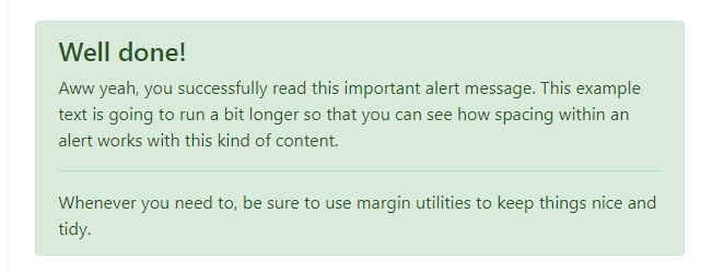
728x90